LOGO DESIGN PORTFOLIO
BRINGING BRANDING VISIONS TO LIFE
Working with clients is a little different every time. Each person comes to the table with a different vision of what they’re looking for, sometimes more than others they’ve got a basic structure in mind of things they like, or sometimes they just want us to take the wheel and steer. Here are some logos we’ve developed to get folks off the ground that range in complexity and stories. Not everyone on here has a full story to share but we appreciate having them in our portfolio nonetheless.
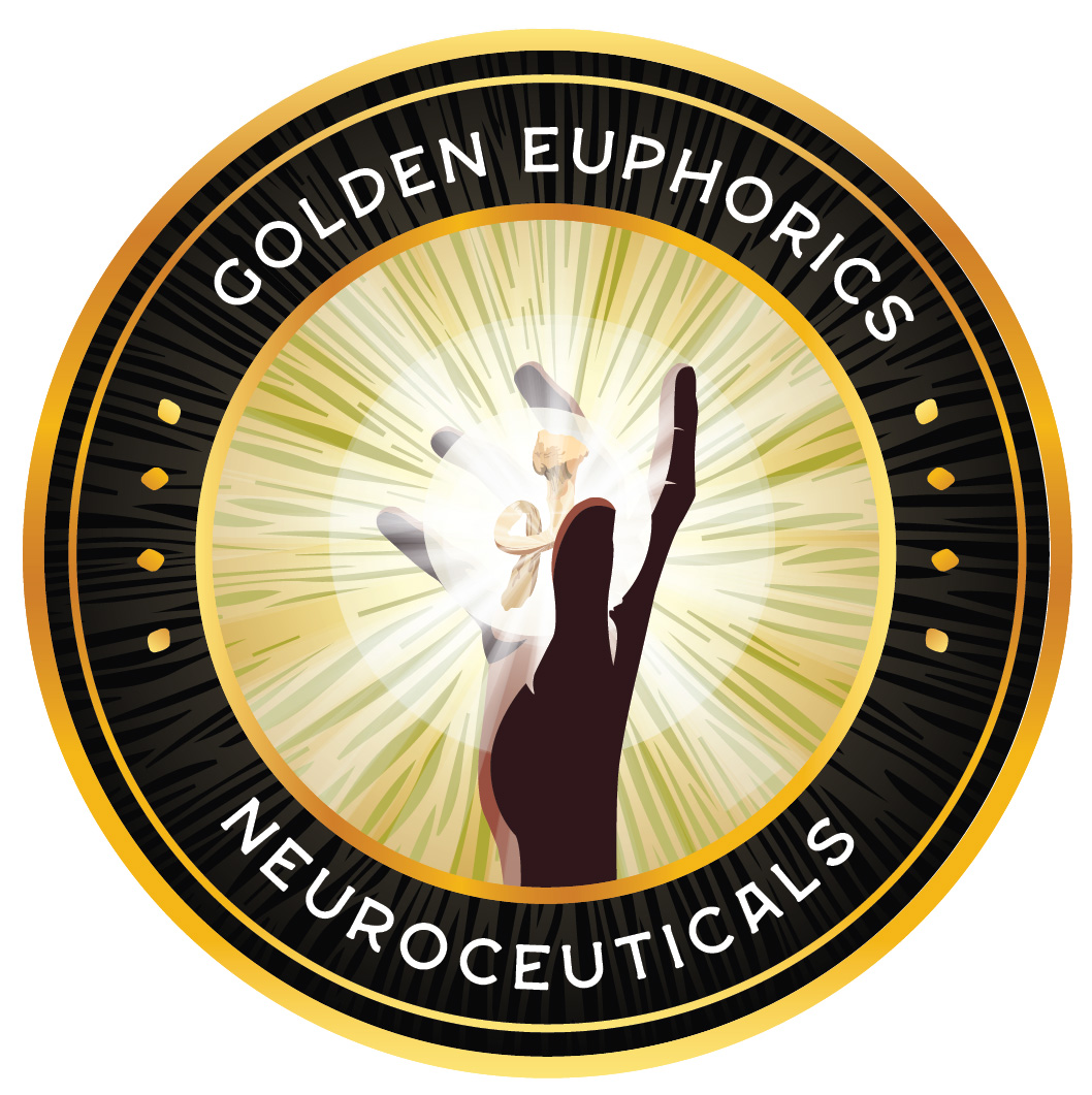
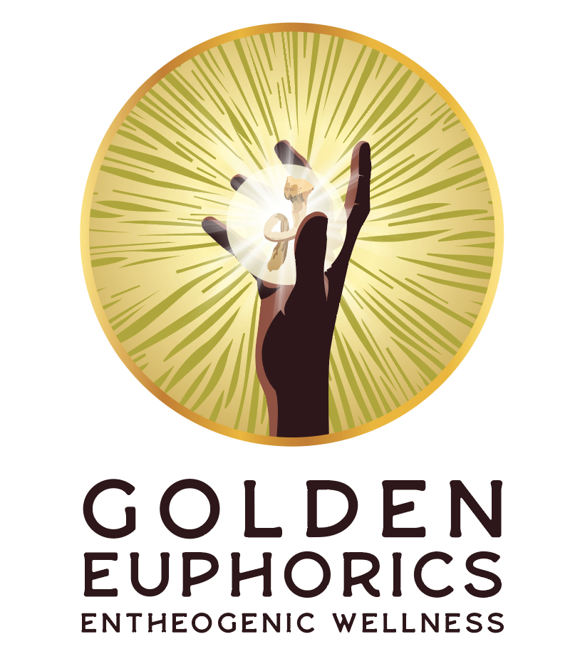
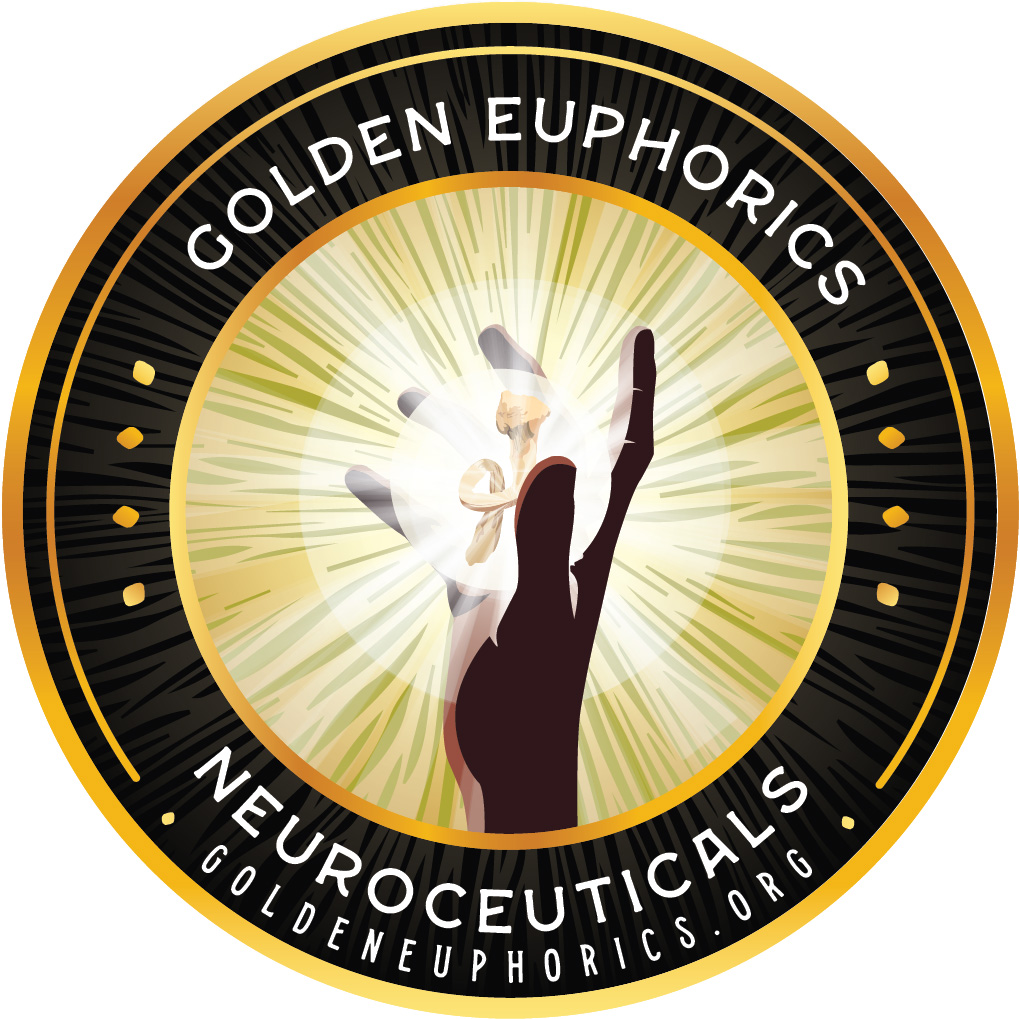
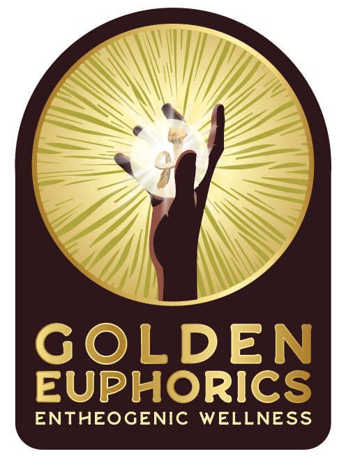
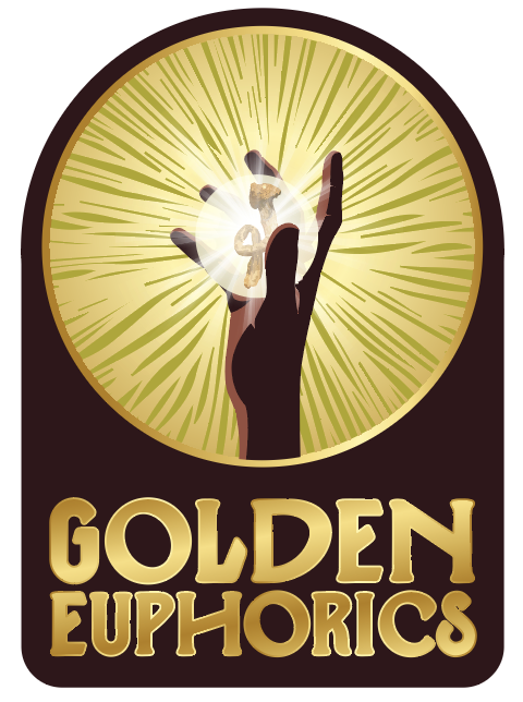
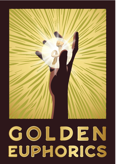
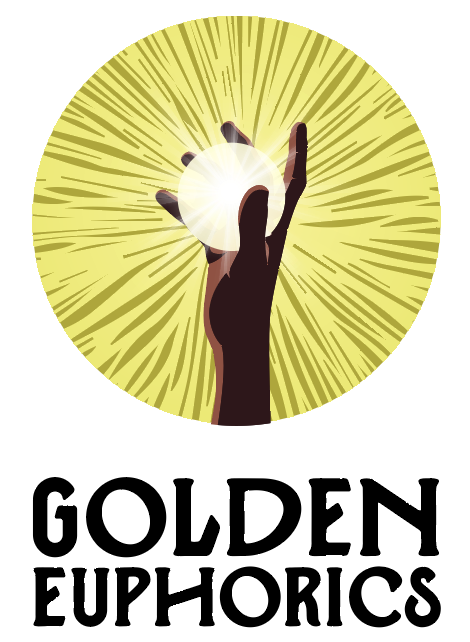
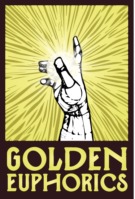
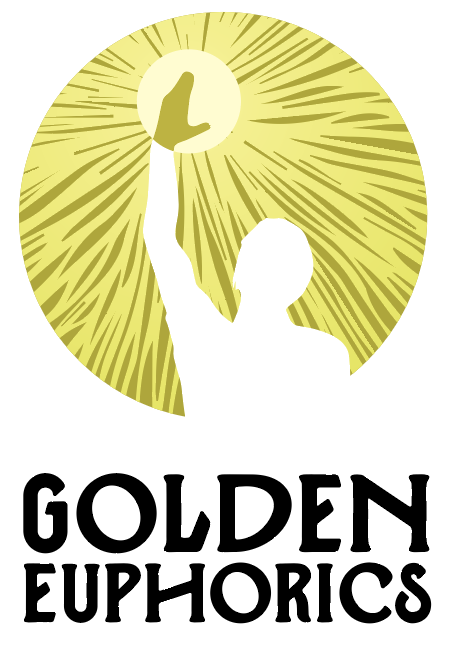
Golden Euphorics – Eugene, OR
Delivering neuroceutical mushroom capsules in an online ecosystem, Golden Euphorics approached us to assist them with redeveloping their branding to establish. amore professional look and feel for their products. Building on a vision of encorporating the spore print of their fungi genetics, along with focusing on the golden elements to pull on the enlightening aspects of their products, we created a series of seals to be used across their packaging, collateral, and merchandise, later developed further in our next projects together.
FINAL LOGO
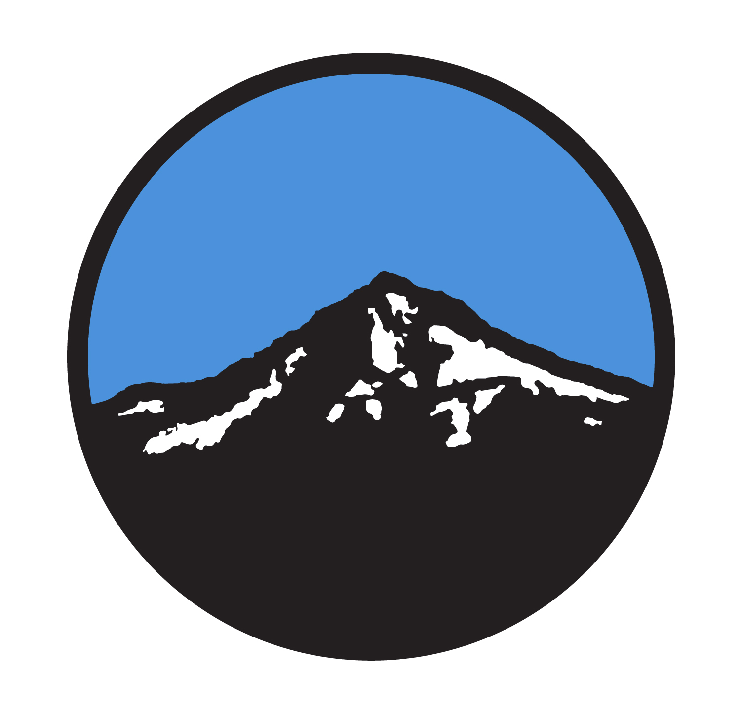
ALTERNATES & CONCEPT DESIGNS
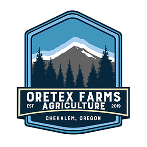
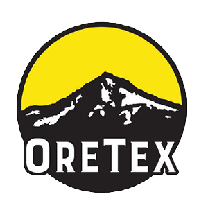
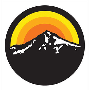
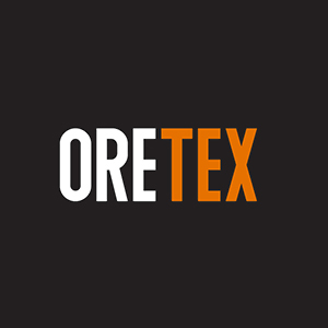
ORETEX FARMS – CHEHALEM, OR
Operated by a set of cannabis industry professionals out of Texas, OreTex Farms sought to bring Oregon and Texas elements into their brand, with a vision of incorporating their property’s beauty into the story. Sharing breathtaking photos of the farms mountainous backdrop, we found ways to bring this brand to life through a series of colorful options. This project had many iterations and lots of visual directions we pursued before finally landing on these logo elements, so we thought we’d share some of the fun ways we tried to go in this portfolio highlight.
FINAL LOGO
ALTERNATES & CONCEPT DESIGNS


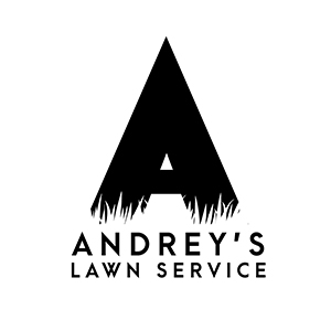
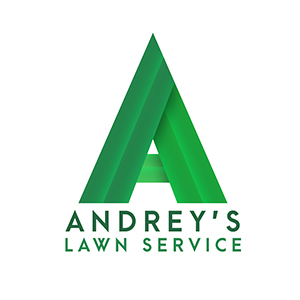
ANDREY’S LAWN SERVICE – SACRAMENTO, CA
Andrey’s provides full lawn care and maintenance to their clients in Sacramento, CA, offering lawn and bush care, sprinkler support, and yard clean up packages. This fun design project offered some guidance into the idea of incorporating blades of grass or leaves, and this lower case serif “a” was just begging for a leaf to be added. Below you’ll see some variations in the logo as we arrived to this one but working with this blue collar company was a great way to help boost their image.
FINAL LOGO
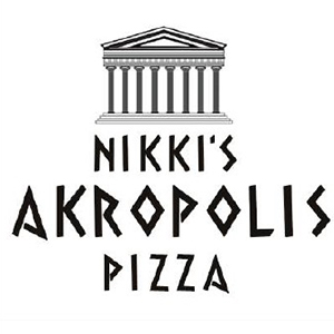
NIKKI’S AKROPOLIS PIZZA – LAS VEGAS, NV
Nikki’s Akropolis Pizza provides Mediterranean cuisine, blending Italian and Greek style meals to patrons of Las Vegas, NV. This unique blend of flavors offered a unique taste and variety of meal options for guests looking to escape the madness of the strip in search of something fun and delicious. Working together with this small business, we crafted a simple logo along with a menu to capture their product offering.
FINAL LOGO


ADDITIONAL CLIENT LOGO DESIGNS


A WORLD OF OPPORTUNITY AWAITS
DESIGN | WEB SERVICES | MARKETING | CONTACT
© CONQUERED HEIGHTS MARKETING SOLUTIONS, LLC. All Rights Reserved.